The Magic of BoxHop
BoxHop helps customers reap the benefits of local shopping through the use of a domestic shipping address which unlocks discounts accessible only to US-based customers. Beyond discounts, customers also save on shipping through consolidation. BoxHop ships in bulk with major carriers and the savings are passed on to customers.
The Problem
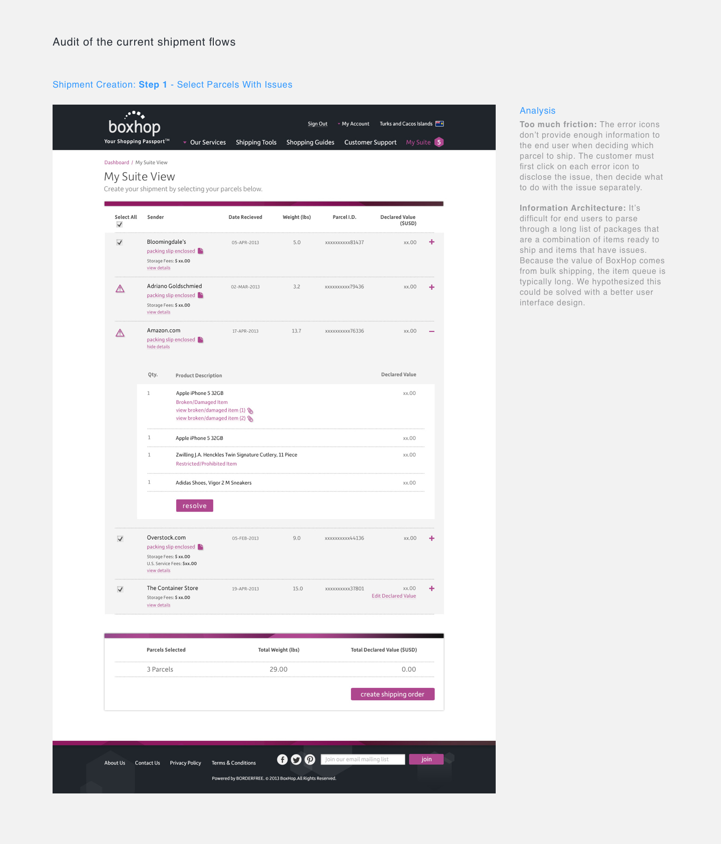
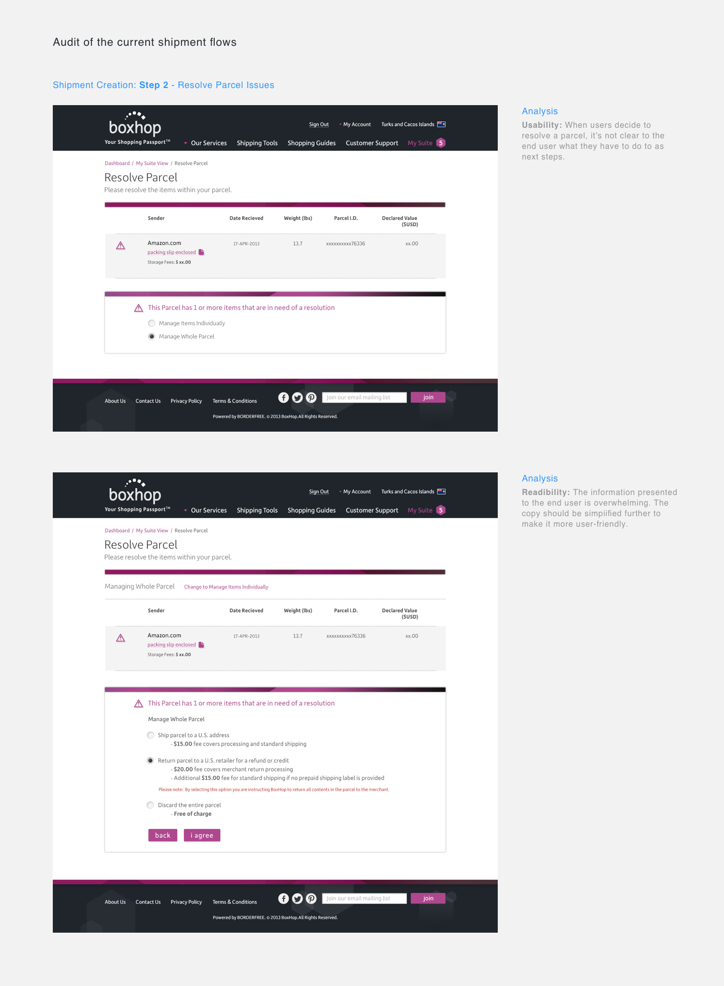
The customer support team reached out to the design team notifying us that they were consistently helping customers with a small set of complex shipping issues that should have been solved on the checkout page. Tooltips contained links to the FAQ page were already provided. After an audit of the checkout page, we knew improvements had to be made and set out redesigning the experience.
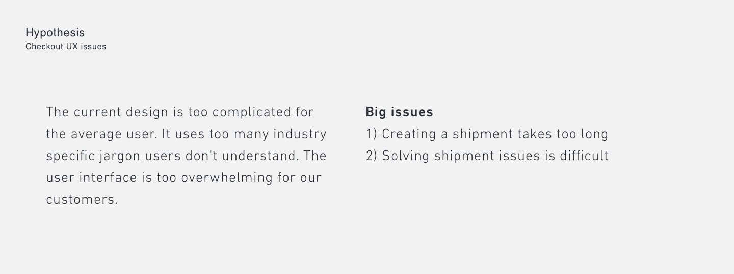
Our hypothesis was that the user interface for the resolution flow was too complicated for international customers. Not only was the page in English, but the amount of data held on the page deserved a better information architecture and a simpler user experience. We conducted an audit of the user experience and found many problematic areas.
Research
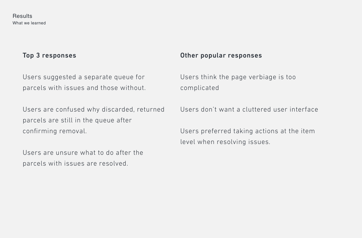
We conducted research to learn more about the experience firsthand.
The results were not surprising. We knew the issues existed, but research validated the problem and we felt comfortable moving to the design phase.
An AH-HA Moment
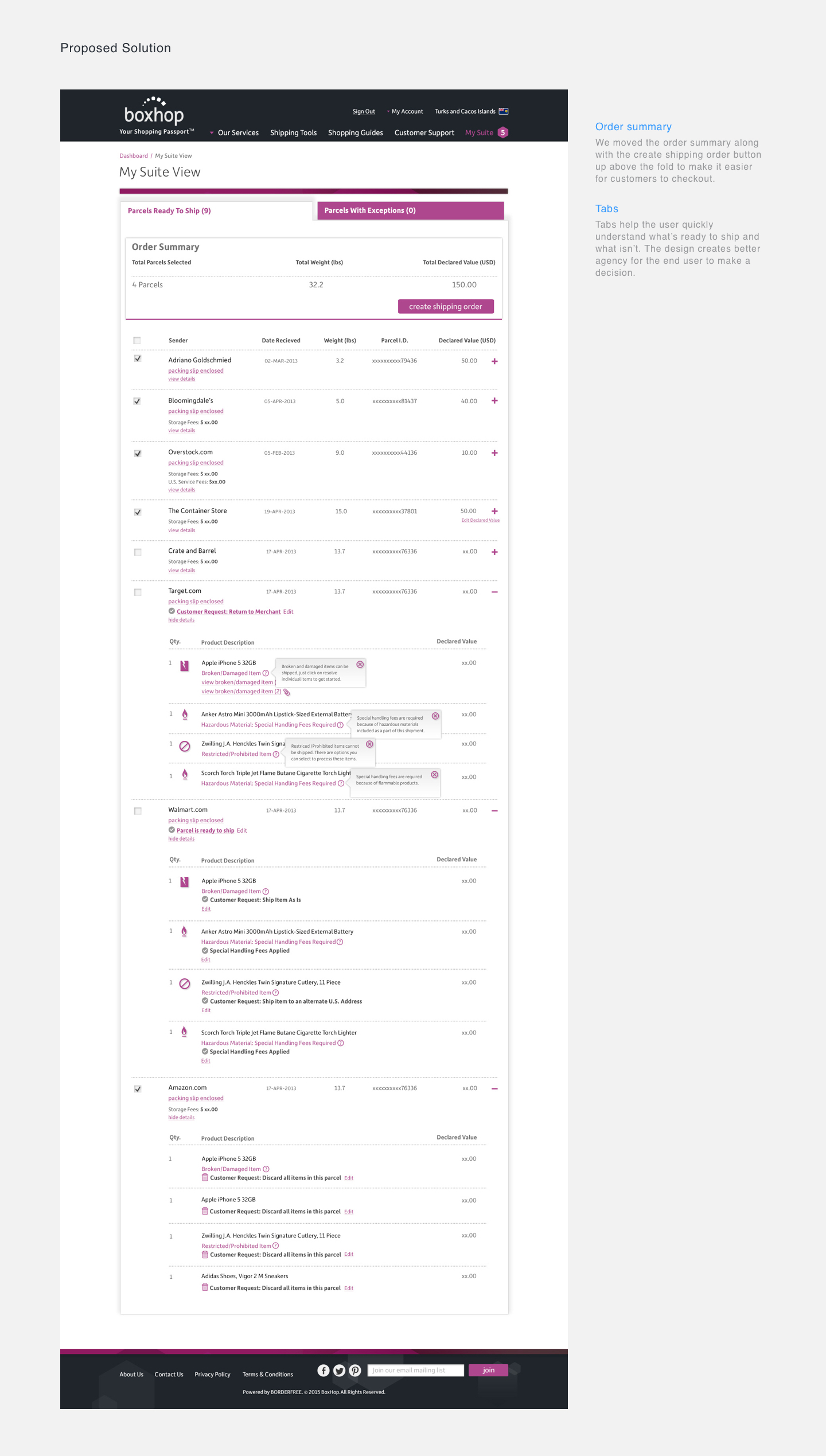
During our last round of research, we stumbled upon an ah-ha moment. Back when we first launched the checkout page, two types of parcels: 1) parcels with shipment issues and 2) parcels ready to ship, were queued in the same column. We believed customers wanted to solve parcel issues prior to shipment, so highlighting them in the queue made sense at the time. A participant suggested we decouple the two types since it would simplify her shopping experience. We looked at the data to understand whether the checkout design was a source of friction and noticed accounts with an average number of shipped orders (considered tier 1 customers) had no fewer parcels needing resolution, than those considered average tier 2 customers. Problematic parcels might even be getting in the way of customers completing new orders.
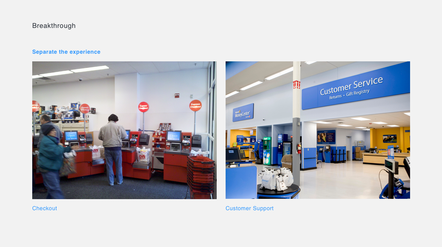
It made sense after we evaluated the checkout experience in real world commerce. We separated the task flow with tabs that focused on different purpose for the customer. This mimicry of the real world experience where customers are never in one queue to checkout or receive customer support was an incredible breakthrough.A simple redesign was considered a low cost effort that might help our bottom line. A decision was made to test the new design with a small group of users.
Design
With the research completed, we proceeded to the design phase armed with the information we had. The designs needed to be simple, useful, but also advance the user towards shipment.
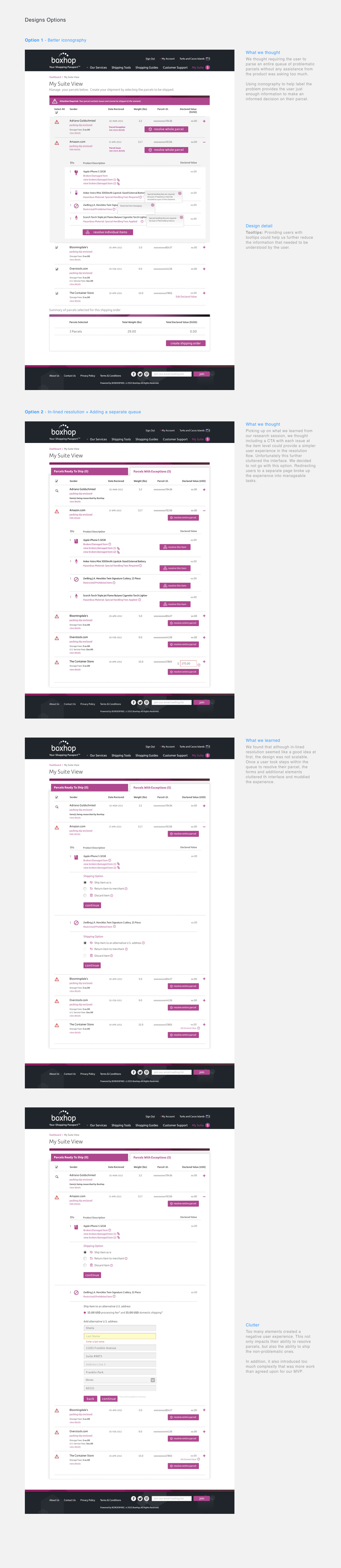
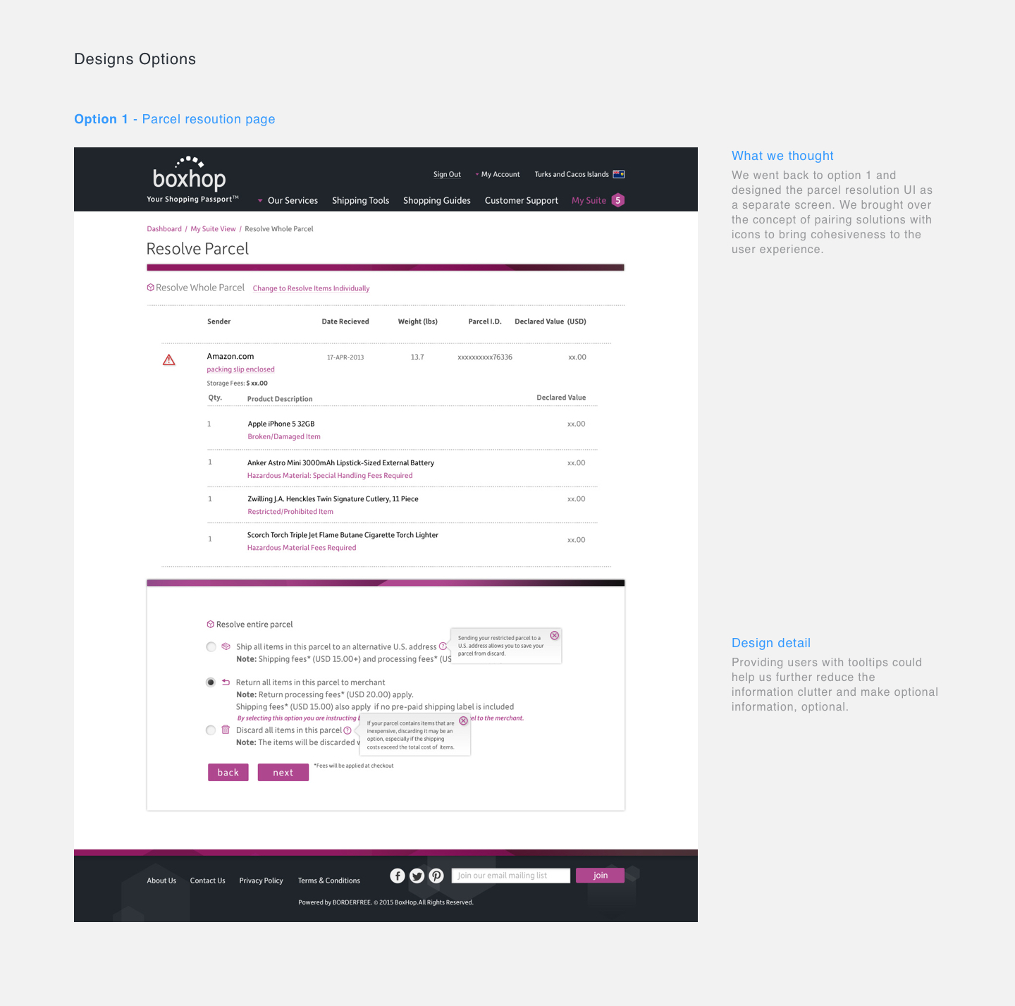
We felt comfortable launching with option 2. It didn’t include as much rework for engineers and only involved front end updates. The APIs remained the same with no additional logic necessary.
The Results
After the launch of the redesign to a small group of users, we noticed an increase in order completion and a slight improvement in parcel resolution metrics. While the design hadn't solved for all of our users' problem, we knew we had provided them with a better checkout experience that met the company's business needs as well. BoxHop continues to evolve the checkout experience and we look forward to iterating the parcel resolution so it meets our customers' shipping needs.